As wedding photographers, we’re almost entirely dependent on our website to promote our services. Whether it’s to get a feel of your work, understand your process, or check out your price point, your website will be the thing that convinces potential clients to either get in touch, or walk away.
But with so many things to think about as a solo creative, keeping your wedding photography site slick might not be top of your list. But worry not, it needn’t be a chore. We’ve pulled together the main things you should focus on to ensure that your website’s features and functionality are best in class. Let’s begin…

Photographer: Theresa Sherron
Clear user flows
Your website should take your users on a carefully orchestrated journey. From beginning to end, they should intuitively understand what to do, and where to go next. In order to make sure this is the case, you need to begin by asking yourself:
“What do I want a visitor to do by coming to my website?”
Your website doesn’t just exist to look pretty. It’s there to help you attract potential clients and grow your business. So you need to make it work for you.
The purpose of your website will depend on your personal business style. For many photographers, the purpose is likely to be to get a visitor to inquire. In that case, then your website should make the ‘Contact Us’ button (also known as a call-to-action), the most visually prominent thing on the page. Rather than putting every link in the same size or color, instead make that one single call-to-action to the most eye-catching.
It usually makes sense to have your core call-to-action at the very beginning of the page, and again at the bottom. That way users are in no doubt about where they should go as they browse through your site.
No dead ends
This brings us to our next point… at no moment, ever, on any universe should a single page on your site have a dead end. Every singe page should have an onward journey. Think about what it makes most sense to include as the onward yourney for each page. For example:
Portfolio → Contact page
About me → View Portfolio
Pricing → Contact page
The golden rule for any website is, “don’t make the user think”. Your job is to do all the hard-work so they don’t have to. So put yourself in the shoes of a brand new visitor, and ask yourself, “if I just read this information, where would I next logically want to go?” and then simply design your site layout and structure around that.
Page names that make sense
We mentioned before, “don’t make the user think”, and this is especially true for page names. The internet is built on convention. This is the reason you can go to any of the millions of sites on the internet and instinctively know how to navigate around it. So whilst it might be tempting to label a page something fun and creative, don’t. If the user can’t immediately find what they’re looking for, chances are that they’ll simply leave.
Keep it simple. Just call a spade a spade. For example, instead of calling Pricing something euphemistic, like Investment, just stick with pricing and explain the rest in the page copy.
Image optimization
Having huge images on your site will make it load reaaalllly slowly. This is will not only affect your SEO, but it is also just a terrible experience for the user. In fact, Kissmetrics recently published a study that showed that 1 in every 4 visitors abandon a site if it loads too slowly. That’s 25% of your potential new down the drain.
If your site is running slowly, or if you know that your current image file sizes are huge, then we suggest using JPEGmini to reduce the size without affecting the quality.
Share functionality
The most successful wedding photographers of today are those who are killing it on their social media accounts. So make sure that your website and social channels are seamlessly integrated with one another by linking to your social accounts on every page.
The easiest way to do this is to simply enable social icons, which are included in most site templates as standard.
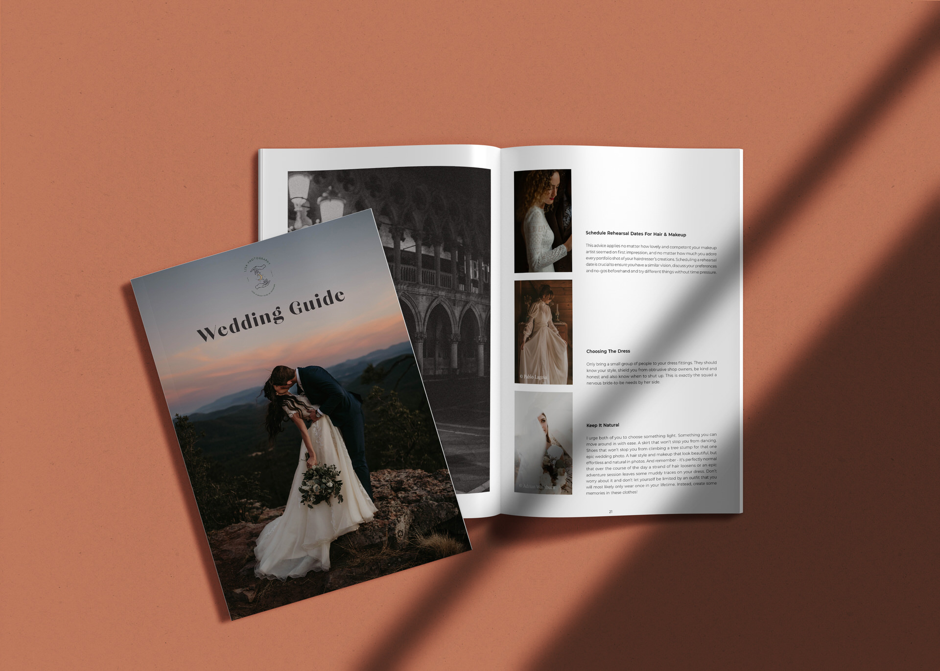
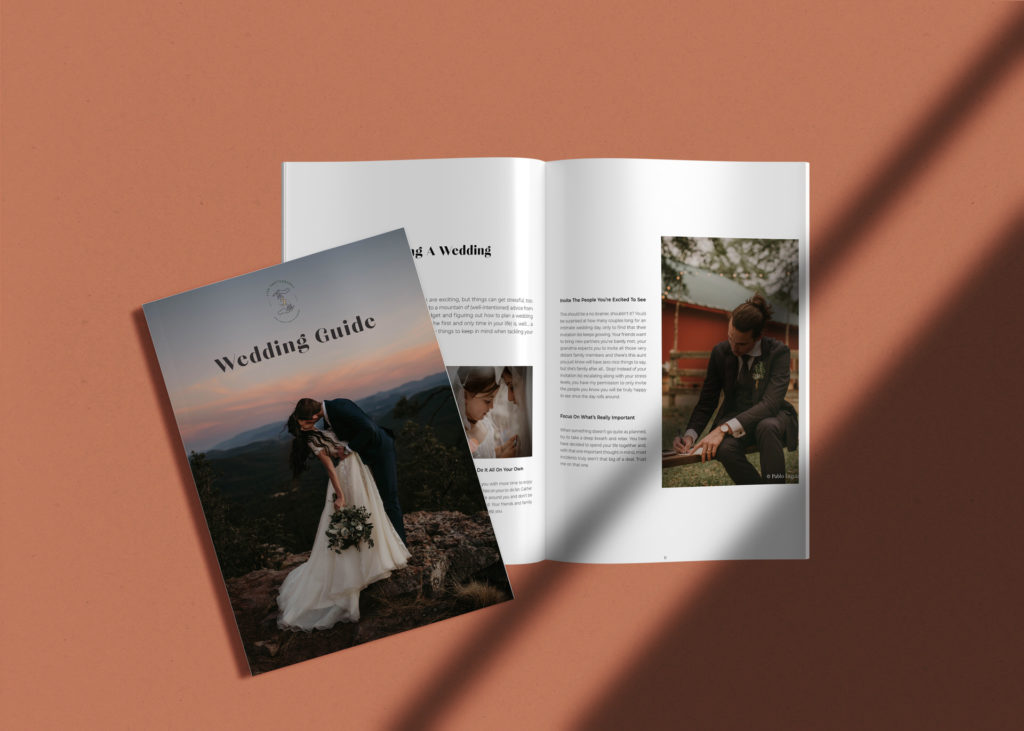
Curate your portfolio
Be sure to show off your finest work on your site with an up to date portfolio. These images don’t necessarily have to be your latest shoots, but they should represent the work you are most proud of.
Your portfolio should be one of the first things a visitor sees when they land on your site. This is your chance to convince them to get in touch, so make it eye-catching, easy to navigate through, and be sure to include a link to your contact page as the user’s logical next step.
Be sure to blog
Having an up-to-date blog on your site is one of the best things you can do to boost your sites search rankings (SEO). Couples are searching for very specific longtail keywords, for example, Romantic elopement in Bordeaux. You want to be top of the list of their search results when they do.
So every time you shoot a wedding, write a post that describes exactly what it is and where it was. Over time you’ll start to see that content translate into increased organic traffic. And who doesn’t love a freebie?!
Blogging is also a great way of giving potential clients a glimpse into who you are as a person. You’ll be able to show off more of your personality and style, which is really helpful for couples trying to find a photographer that is a good fit for them.
Have an About Me page
This is your chance to shine. If a visitor is on this page, they’ve probably already decided that they love your work, and are now figuring out if you’re someone they’d be comfortable sharing their day with. So spend time carefully crafting an About Me page that reflects the essence of you. Don’t try and think too hard about what will ‘sell’ you the best. Instead just be true to yourself and write candidly about who you are and what you stand for.
Talk money
No matter whether you decide to publish your prices or not, you need to have a pricing page. This is one of the main reasons that people will be coming to your site: to find out whether you’re in their budget, and if they can’t quickly access this info, you’re likely to lose that business opportunity forever.
Be contactable
Your contact page should be designed with the user, not you, in mind. Whilst you might want to know lots of details about the day, the location, what the couple are looking for etc, by creating lots of fields for them to fill out you’re increasing the chance they’ll decide not to bother. Keep it simple and to the point.
Ideally your contact us page should have both a form and a text link to your email address. Yes this might be trawled by spam bots, but honestly it’s worth it to make sure you don’t miss out on couples who don’t like filling in forms.
Get your testimonial on
Couples looking for wedding vendors are probably in a state of nervous scepticism. They’re having to think of a thousand different things, and manage a thousand other creeping costs. They want to know – without any doubt – if you’re someone they can trust.
That’s why it’s a great idea to include a few testimonials and reviews some where on your site, as well as any credentials or awards you’ve got. It might not be a clincher, but it will certainly help to encourage a potential visitor that you’re one worth pursuing.
That’s all there is to it. Go through this website health-check and you’ll be up and running with a power portfolio in no time!
Connection is what it’s all about. Feel free to reach out to us with any comments or questions you might have, even if it’s only to say hello. If it wasn’t for our beautiful community, this place just wouldn’t feel the same.


[…] are some other important website health-checks to run through to make sure your site is in tip top […]
[…] want your Insta account to be a sales tool. That’s why you should connect your IG to your website, blog, or anywhere else you want to direct interested clients […]